
%20(1)%202.png)
Sep 2022 - Dec 2023
Figma, Figjam, Zoom, Balsamiq, Useberry, Usabilityhub, and good old pen and paper
In addition to me as the UX/Ul designer, the team consists of the CEO, CTO, and three engineers
Lead designer, Ux Research, Ui Design, End to end Testing, and Usability Engineering
Initial Stage: Understanding the Existing Dashboard:
We started with a basic dashboard for doctors, which was being piloted by a few practitioners. Our primary focus was obtaining certification as a medical device, ensuring compliance with stringent MDR standards
Regulatory Approval: Navigating the MDR Process:
Achieving medical device certification was our first milestone. While I focused on aligning user needs with regulatory requirements, the engineers ensured technical compliance, and the CEO and CTO guided the strategic direction. We dove deep into documentation, mapping out the MDR process step-by-step, and tackled each requirement as a team.With a small but dedicated team, we successfully reached this critical milestone.
Phase 1:
Focus on MDR Compliance and Medical Device DevelopmentUnderstanding MDR Requirements:
The initial focus was on navigating the MDR process to ensure the medical device met regulatory standards. With limited prior experience in the medical field, thorough research was needed, starting with learning about MDR requirements and understanding the complexities of medical device approval.
Competitive Analysis & Interviews:
To gain deeper insights, a competitive analysis was conducted, followed by in-depth interviews with 5 doctors and 3 nurses. These participants, from both hospital settings and private practices, shared their experiences with heart failure patients. Conversations highlighted challenges in tracking patient symptoms, desired features, and frustrations with existing tools and methods.
Usability Testing:
Insights from these interviews shaped the usability testing approach. Both guided tests, where participants completed specific tasks, and unguided tests, allowing free exploration, were used. This helped identify not only obvious usability issues but also more subtle design pain points in the dashboard.
Refinement of the Dashboard: Through multiple iterations, the dashboard was refined to ensure a more intuitive and user-friendly experience for doctors and healthcare professionals, making it a reliable tool for daily use.
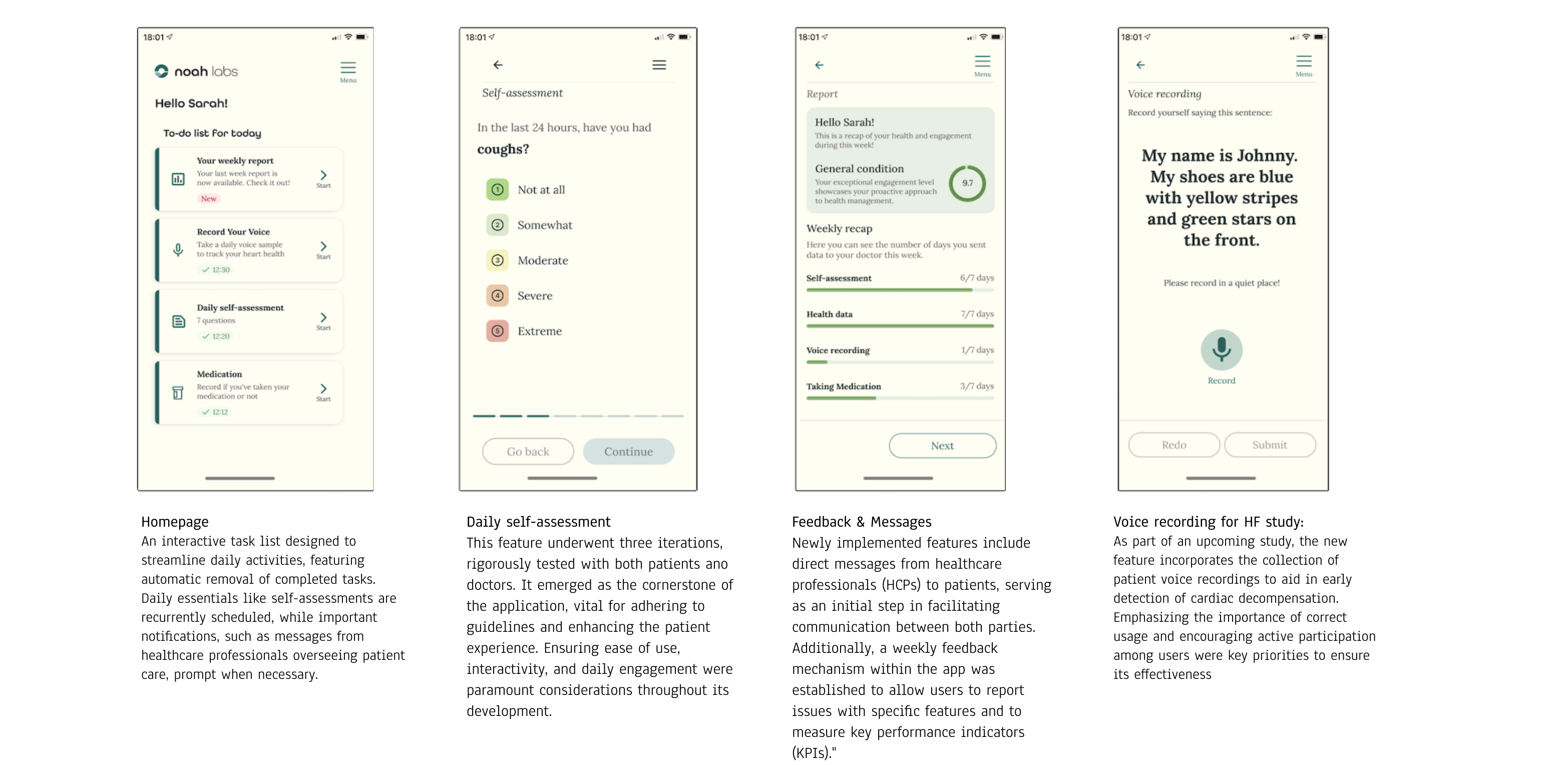
The MVP B2C app was developed specifically for heart failure (HF) patients, with an emphasis on making daily symptom monitoring simple and effective. A competitive analysis revealed key gaps in existing solutions, such as the need for a more intuitive daily tracking process.
These insights shaped the design approach, ensuring that the app addressed these gaps and better met patient needs.A core feature was a daily check-in flow, enabling patients to easily log their measurements and symptoms.
The final design included a clear, straightforward list on the homepage, making it simple for users to access the most important tasks. Patients could quickly update their daily goals, track symptoms, and send their measurements to their doctors.
Scalability was also a key consideration, with room for future features like medication tracking, educational resources, and feedback from healthcare providers. The goal was to create an app that was not only functional but genuinely supportive in helping patients maintain their daily routines, while allowing for growth as their needs evolved.
Regulatory Complexity:
Navigating the MDR process presented a steep learning curve. Key strategies, such as deciding tasks, consulting with external experts, and using an external tool to track updates, helped create a structured approach. Regular discussions with the team ensured everyone remained aligned and aware of regulatory requirements, which facilitated a smoother certification process.
Balancing Usability with Compliance:
As a junior designer, having a structured, step-by-step approach was beneficial. This clear path allowed for focused learning and helped manage the excitement of designing and creating new features. While it was essential to adhere to compliance standards, the process also provided an opportunity to learn and grow in the field.
Managing Rebranding and Development:
Establishing the design system was a methodical way to transition from the old to the new visual identity. This approach ensured consistency and provided a framework for future design work. However, as features were developed faster than our small engineering team could implement them, limited testing opportunities with patients arose. This challenge was further complicated by language barriers and geographical distance, making it difficult to gather valuable feedback on prototypes for the patients app.


