User Research
Understanding the product
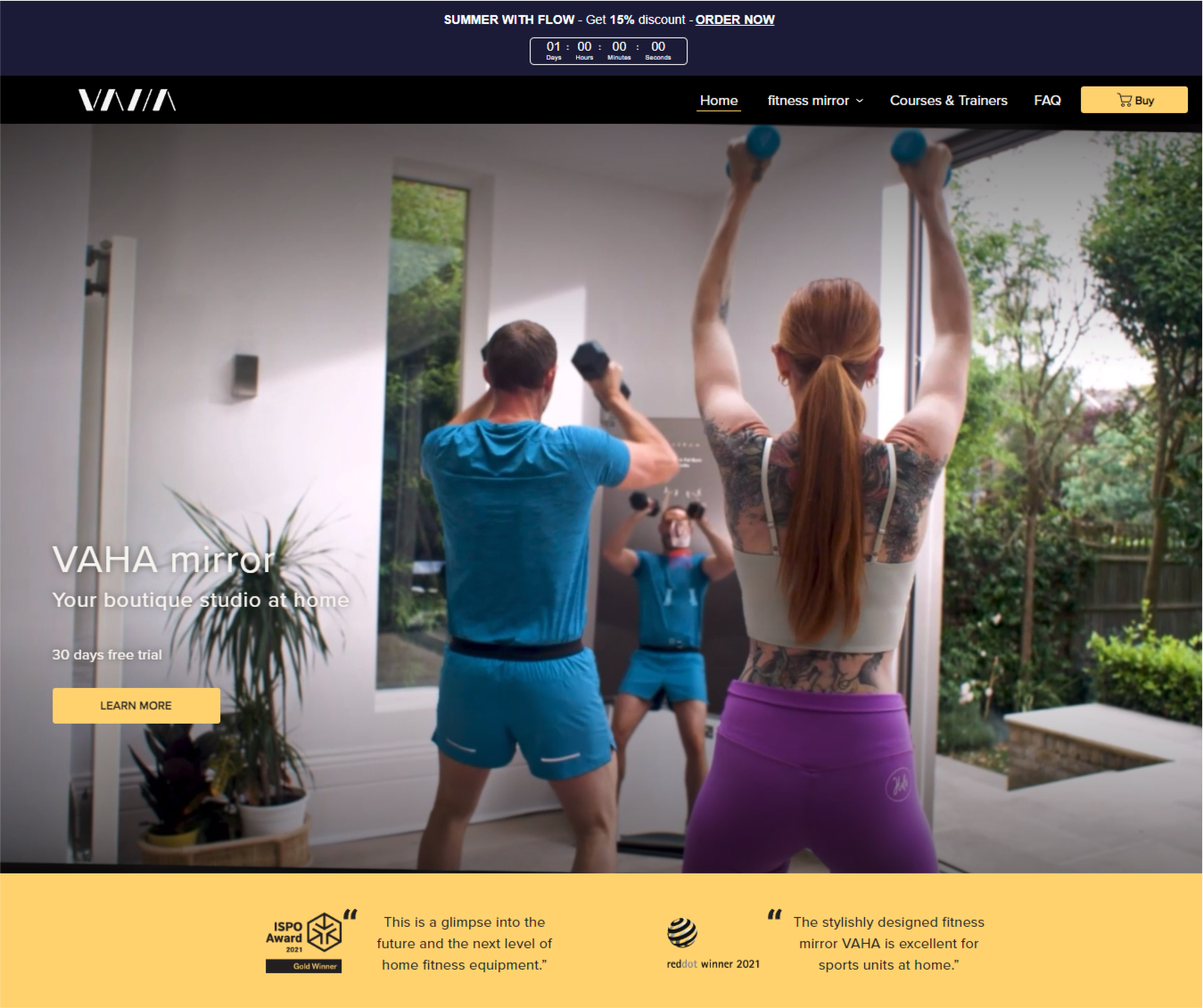
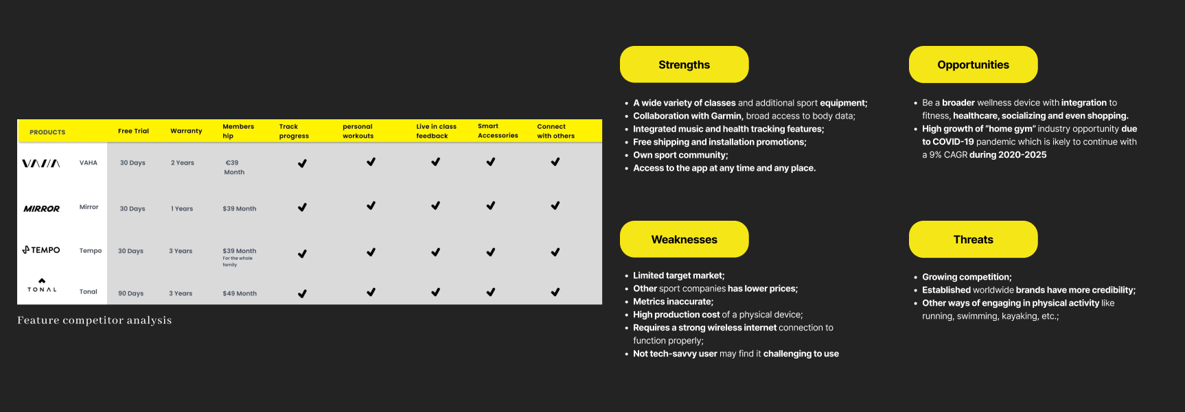
The first step in our design process was to complete a SWOT and feature competitor analysis of other similar providers even though they cover markets outside Europe. The main goal was to understand the market and highlight existing strengths and weaknesses within our product to aid us in making informed decisions during the next stage of the redesign. In general, the products we compared more or less provided similar services which makes it interesting to see how the product can stand out in the future if those providers enter the European market. However, for this project, we are focusing on E-commerce sites so we chose to focus on the site design. The site currently is used to sell interactive fitness mirrors with the subscription app.
Usability test on the existing website
1–1 usability test on the existing site to observe the customer experience. As you know, it is an E-commerce site, and it is there to sell the mirror, Simple right? But what we observed other than the technical problems with the site crashing before finishing the order, was there was so much input on every page in addition to some missing information that our customers were looking for such as the about the company, and who they are. What do they represent and what do they stand for?
Key Findings
After conducting a site audit, in addtion to the 1-1 usability test there was 3 key issues:
- Our users used Google plugins to translate the page even though the brand market itself is international and provides English content the site was only in German, while the option for English will change the region too.
- The fitness mirror is a new and niche product and our users failed to get information about the technology and the story of the product on the website. while other competitor uses this to their advantage and create a connection with the users.
- Our users were confused about the price of the subscription, the mirror itself, and the installment options. and they took on average 1.4 minutes to scroll through the home page but still asked us about the mirror.
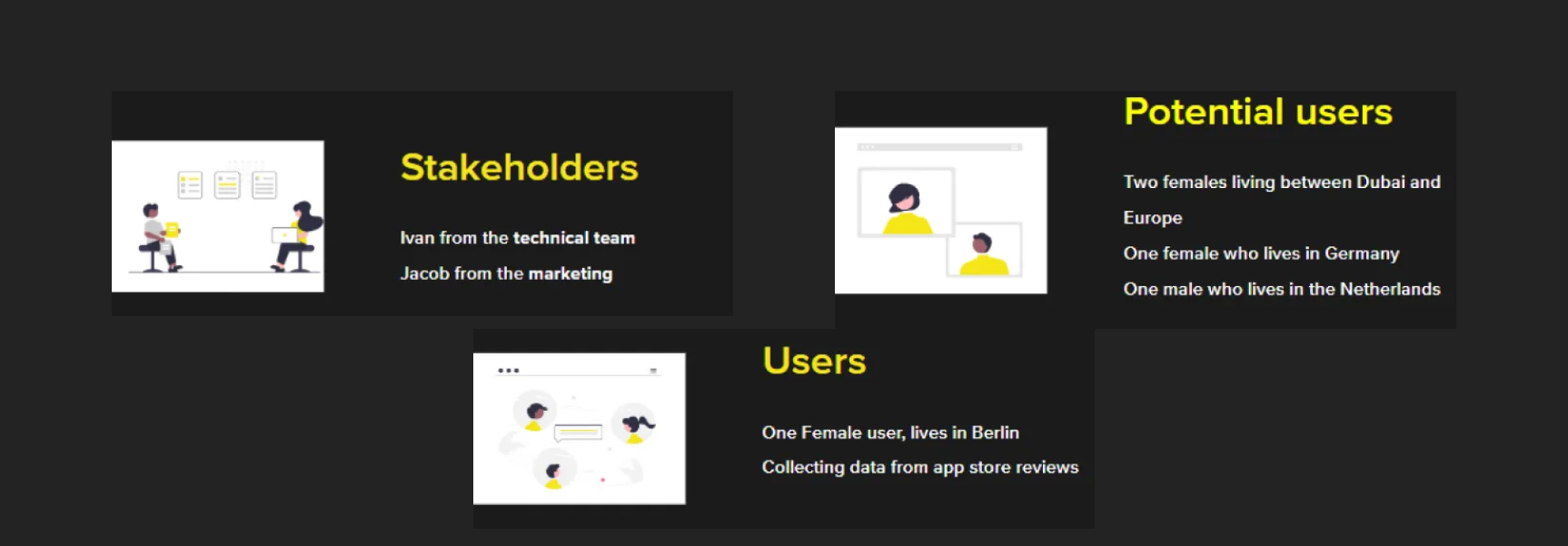
Users interviews
Our next step was to talk to the stakeholders, in this case, we talked to Ivan from the technical team and Jacob from the marketing team. We Also talked to one current user of the mirror and since we couldn’t reach more users we also took notes from all the reviews that users lift on the app store. Finally, we spoke to 4 potential users people who showed interest in the mirror. The interviews and the preparation for the interviews happened in two days.With our user research, we were able to split all our findings into an affinity diagram. this helped us to focus on some of the main concerns of the stakeholders and the users there were some interesting quotes and we realized that some themes were coming back regularly like the content of the app, the community, the site navigation, and the brand aesthetic and appeal.
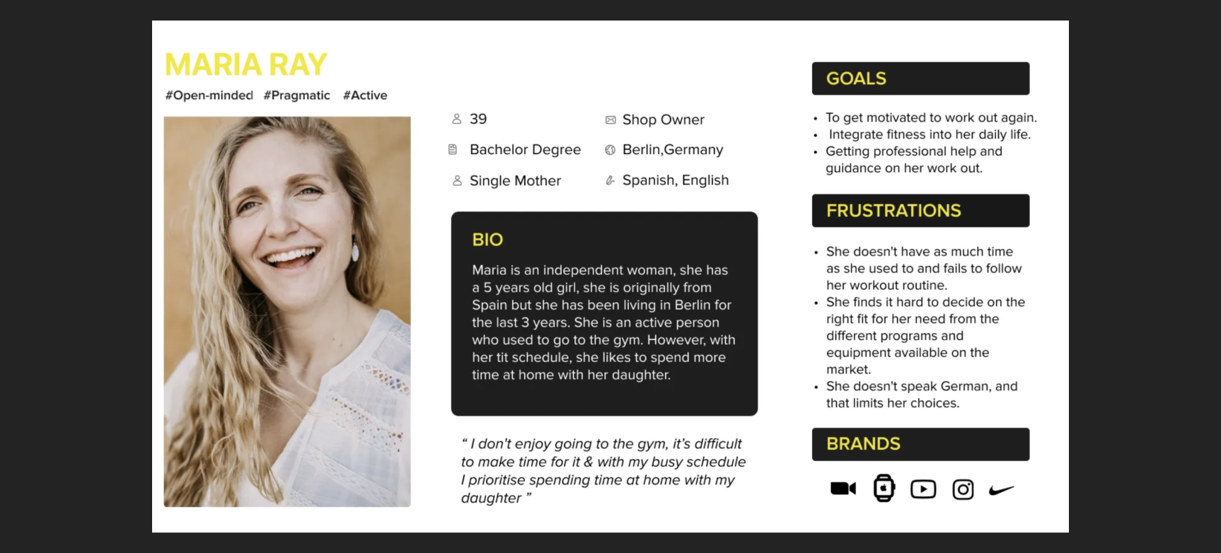
User persona & Journey Map
From this, we developed our persona, which falls into the company's target audience. Her name is Mary and she is a busy single mother who cares about her fitness and wants to be motivated to work out again but prefers activities from home to have more time to spend with her daughter.
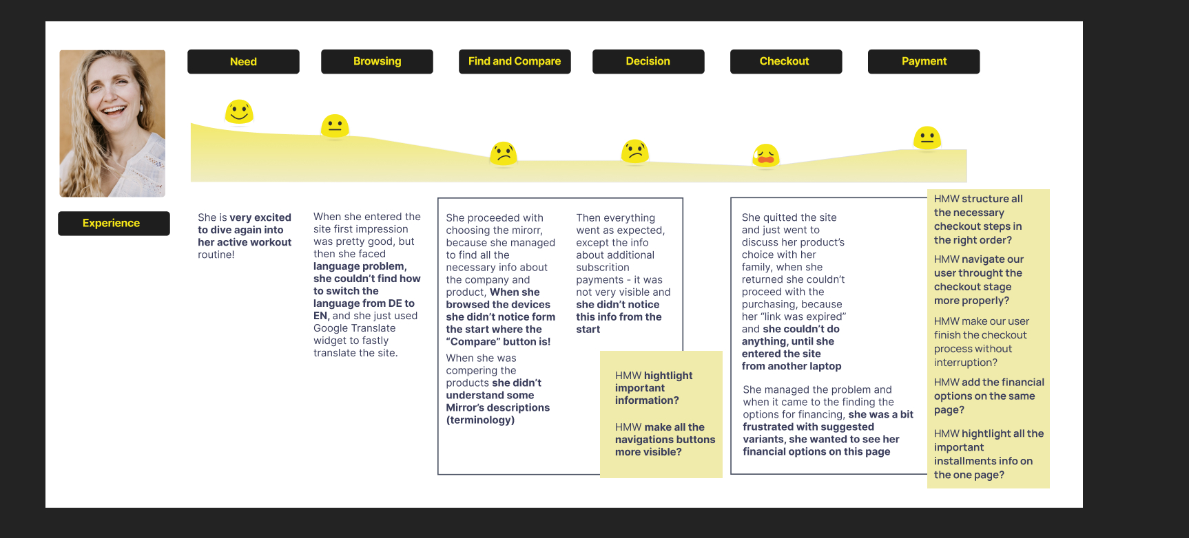
This is her journey and we focused on the site and her journey of discovering the mirrors and trying to buy one of them. We looked at the part where she is trying to make a decision on the site and the checkout process.
From the journey map of Maria, we came up with these “How might we” questions: How might we make all the navigation buttons more visible? How might we highlight important information? How might we make our users finish the checkout process without interruption? How might we structure all the necessary checkout steps in the right order?
User persona & Journey Map
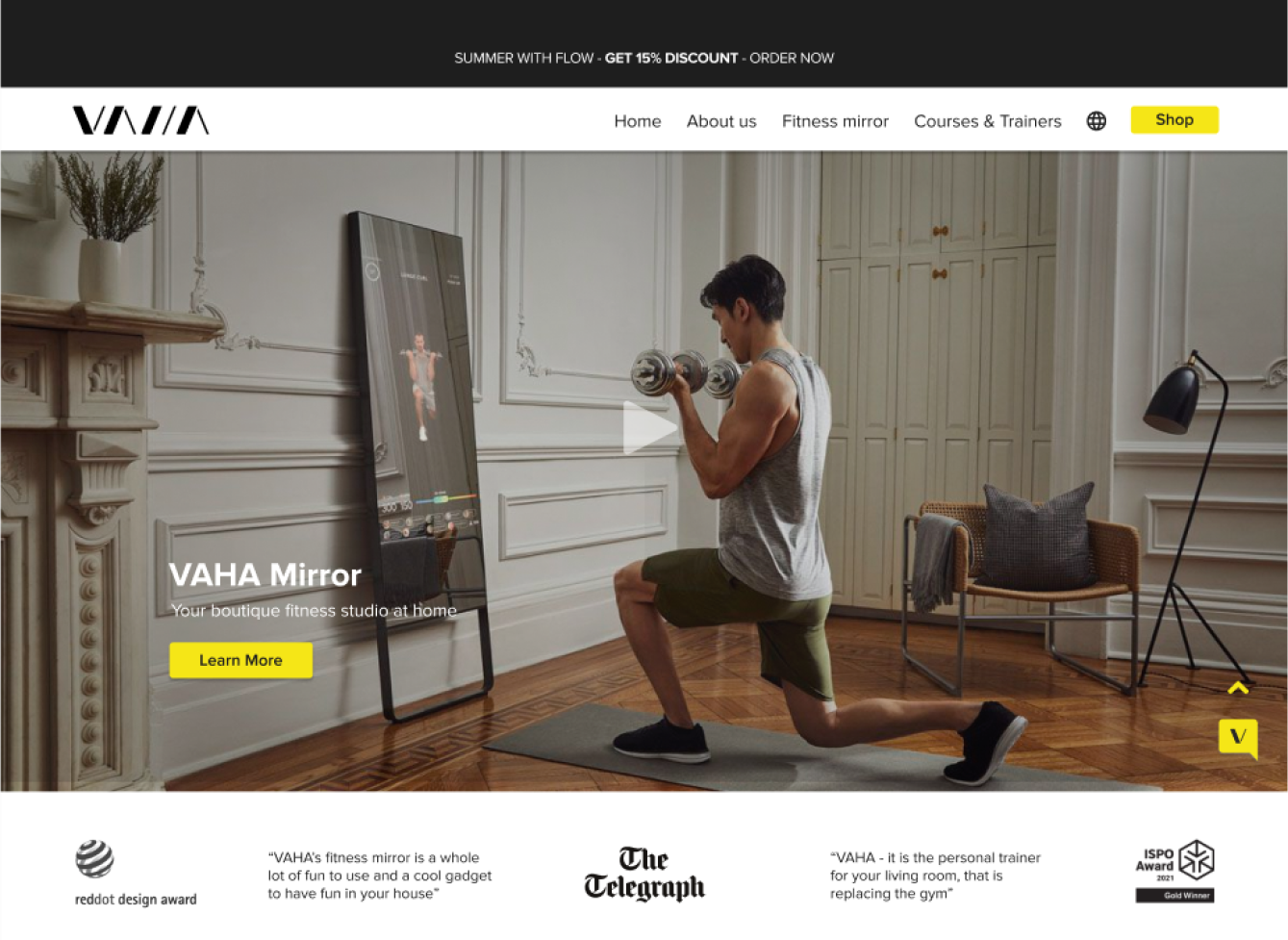
The VAHA website was designed to sell interactive fitness mirrors with workout subscriptions, we have observed that the user experienced confusion about the product and interruption at the checkout which is affecting sales and engagement on the site.
Information Architecture
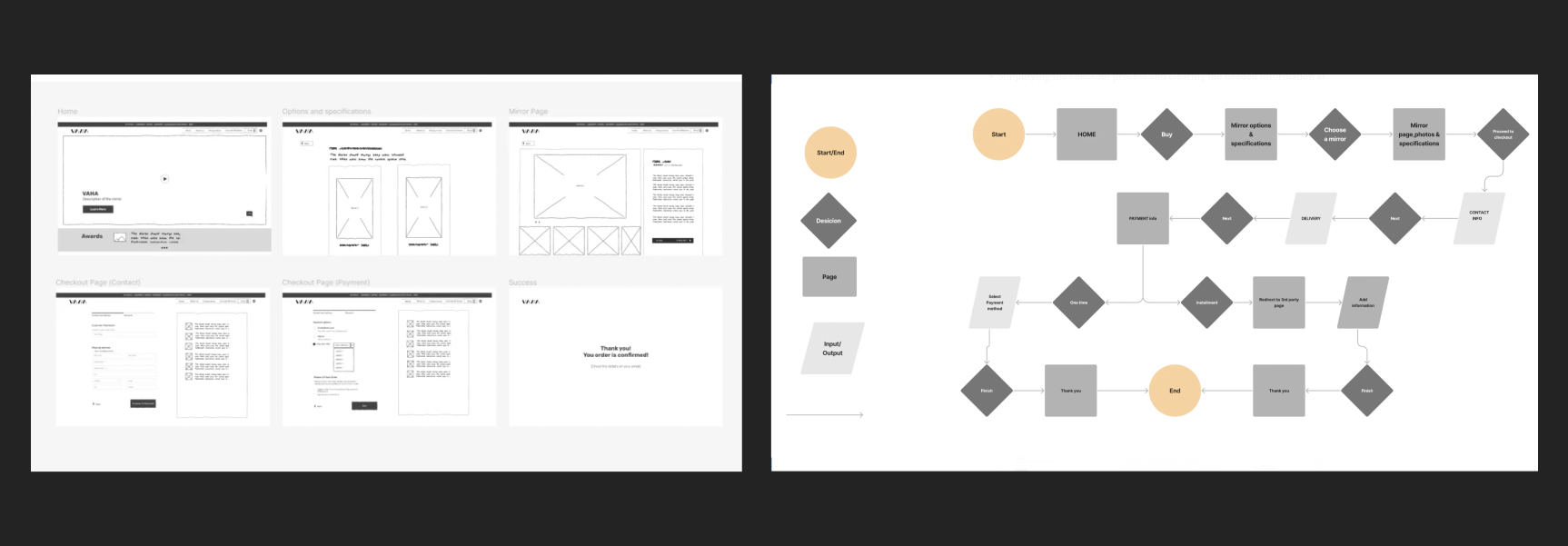
Studying the structural design and labeling of websites to understand how they support user navigation. The goal is to link all necessary steps seamlessly, enabling users to move from design to purchase effortlessly.
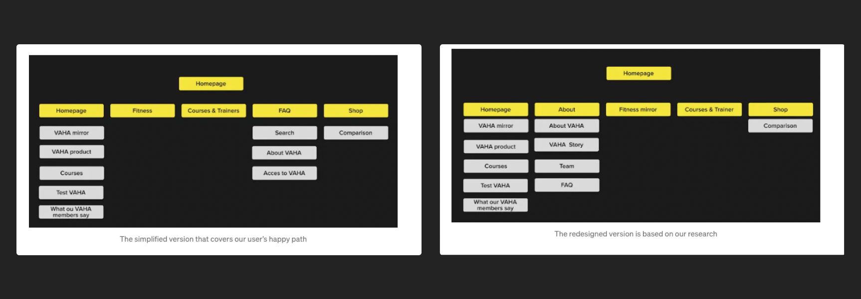
Here is a breakdown of the site map changes
1- Adding the main navigation the About section in about the company, its story, the team, and FAQ, which was in the main navigation before.
2- Removing the extra information from the home page: the link to the magazine and news, the section for the reviews, and compared it with the community and finally Mirror at a glance and based on our 1–1 test before our Lo-Fi. We Found it important not to have the user overwhelmed with information that they can’t find easily from the main navigation. also, the user couldn’t change the language of the site and used Google Translate despite the product being for non-German speakers too.
Design Process
Creating sketches and developing the first Lo-Fi sketches so we could do concept testing. it was demonstrated remotely with 3 users, and from this, we learned that we needed to develop the (main navigation) in our prototype for the happy path as our users started everything with the main navigation in the header.
User flow:
Creating this flow after developing our final site map so we could do the usability testing and see how would our users explore the product and do the checkout.
Changes made
- Simplifying the checkout process and clearing the needed information at each step.
- Adding an about section that contains general information about the company and the story of the company while putting the FAQ in the about section.
Solution
Making it frictionless
Usability test
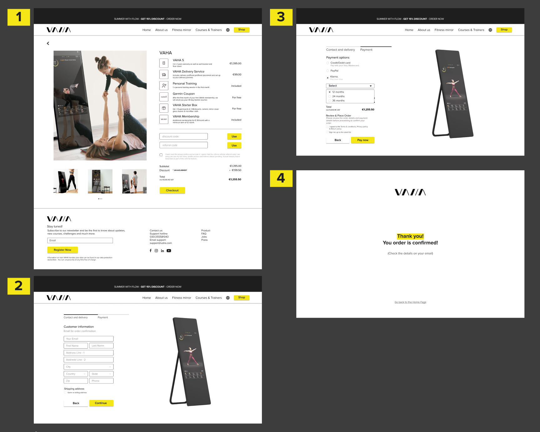
At this stage, we did usability testing with 6 participants, our primary device is a desktop, and we did our usability test online through Zoom with the instructions to get to know the important information about the mirror and finish ordering the mirror. with the test with 4 users 3 female and one male between 32 and 38.
Guiding customers through the Mirrors features, step by step
Changes made
Overall positive feedback that encouraged us to move to the Hi-Fi while adjusting some parts of the design that were not as clear.
- While it was easy to go from the home page to the mirror description, Some participants were overwhelmed with the information on the mirror description page. We thought of making the information in the drop-down list where it is easier to read the information you are interested in instead of going through everything.
- Changing the hierarchy of the font size in the list of prices so it is not confusing.
- Adding an arrow to help go back up to the page when scrolling down.
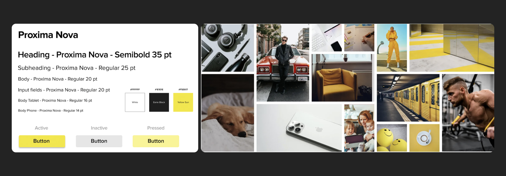
Exploring interface aesthetics
The company has its brand and colors nonetheless we wanted to go through the process and test the feeling and if it represents what we were going for. We decided to keep the colors and typeface of the company based on our interviews with the stakeholders and what we believed was important for the brand. The company attributes:
Supportive •Joyful •Motivatingand from our team discussion of the brand, we decided to push and test other attributes with the exciting ones and these are the final ones: Motivating, Innovative, Elegant, Convenient, Joyful.
We didn’t change the colors from the new brand book of the company, but we chose to make white the main color of the website to give it a fresh and modern look that feels clean and easy to follow.
Future steps
Completing the site map and conducting more usability testing
This is a solid step to ensure that the overall structure and navigation of the site are intuitive for users. Focusing on the "About" section, which was found to be important during usability testing, shows a strategic approach to improving brand awareness and user experience.
Highlighting the brand's "joyful" aspect
Addressing the challenge of conveying the brand's essence through website design is crucial for creating a memorable and engaging user experience. By reassessing how to communicate the "joyful" aspect effectively, the team shows adaptability and a willingness to refine the site's messaging and visual elements to better align with brand identity and user expectations.